 Amanda Hocking
people like books
It’s 7:20 am and I am just finishing up working for the night – and I actually took the day off today. Admittedly, I did some spend the evening chillaxing and playing video games, but it’s the weekend before my birthday. I reserve the right to have fun.
To everyone who commented on my previous blog about review copies – I think I’ve gotten back to all you as of 7:20 central time. If you haven’t heard from me, feel free to nudge me and say, “What gives?” It’s not on purpose – I just spend 5 hours working on the cover tonight and my brain feels fuzzy.
Can I be honest here? I think I can since we’re all friends here. I didn’t expect that many people to want to review Switched. That’s not a bad thing, though. It’s very good, and I thank you all for offering up your time to read a book by a relatively (or… you know, entirely) unknown author. So thank you!
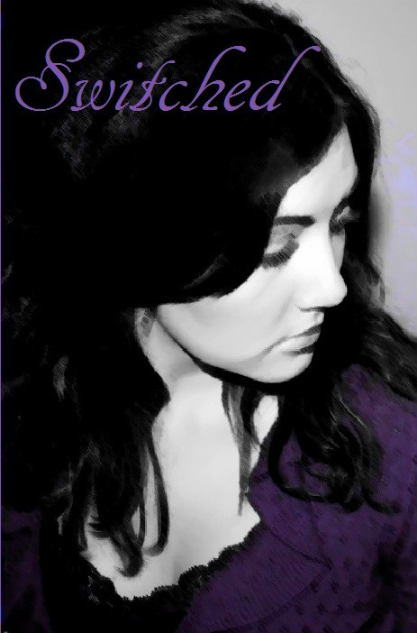
Back to the aforementioned cover – my good pal and bandmate Pete (her real name is Jenna Peterson) and her fiance Matt did the cover. Pete is insanely gorgeous and she’s the model on the cover, and Matt took the pictures using his camera, which is much more high class than my camera.
So major shout out to both of them for being the neatest!
And without further adu, here’s the cover for Switched:

Isn’t Petey a hottie? She sure is.
But now that I’m looking at it – I’m wondering if it’s too dark. Her sweater and the font are both purple-y, but maybe I should do them in a brighter color so it pops more? I wanted it subtle, but I’m thinking it’s too subtle now.
Sigh….
Okay, I just did a few quick changes, because I’m hoping to sleep today. But here’s what I did:
Brighter Purple

Green, which was my original choice for the cover, but I decided that I wanted something more feminine so I want with purple.
Thoughts? One you hate? One you love? Are they all just meh?
Leave a Reply to ylime1981 Cancel reply
First of all, I love the cover. It’s gorgeous! I think colorwise, the green is the most eye catching. Something about it pops more than the others.
First of all, I love the cover. It’s gorgeous! I think colorwise, the green is the most eye catching. Something about it pops more than the others.
First choice- Green
Second choice- Bright
Third choice- Dark
Any of them would be amazing.
i like thr brighter purple best personally. Also think a royal blue would look pretty good (my first thought when i saw the cover was it would look good in blue0
just my opinion