 Amanda Hocking
Even More Covers…
One of the funnest parts of being an author is getting fancy book covers. My publishers in the UK must’ve understood this, because they gave me not one but two different covers for each book in the Trylle Trilogy.
I’m going to be posting them in a second, because they’re awesome and lovely, but first I want to explain to you what they are. These are the covers for the Trylle Trilogy editions that are coming out in the UK, Australia, India, South Africa, and Asia. Below each cover, I’ll also be putting the release dates, since it’s slightly different than the US release dates.
So… here they are!
These are the “adult” covers for the trilogy:
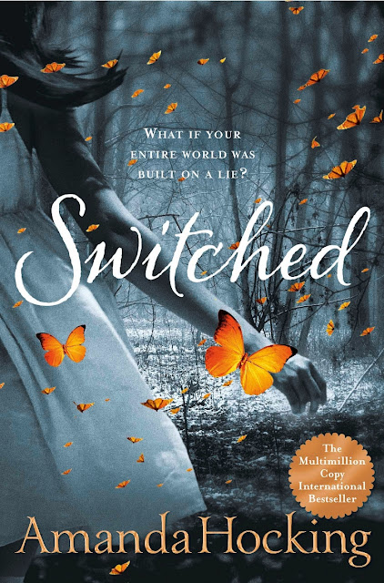 |
| Coming January 5, 2012 |
 |
| Coming March 1, 2012 |
 |
| Coming April 26, 2012 |
These are the “young adult” covers for the trilogy:
 |
| YA Edition Coming January 5, 2012 |
 |
| YA Edition Coming March 1, 2012 |
 |
| YA Edition Coming April 26, 2012 |
You may ask yourself, “adult” version? I thought these were all young adult books? They are, kinda. But my publishers in the UK came up with the idea to add different bonus content the adult books geared more toward adults and different content for young adults. Both versions include the brand-new bonus short story, but in addition to that, they also have different interviews with me and a few other things.
I do want to clarify that when I say “adult,” I don’t mean x-rated. It’s just information that adults might find more appealing than young adults. But no matter which edition you get, the story will be the same, the bonus story will be there, and the extra content will be fun and informative. And the cover will be pretty.
So what do you guys think? What’s your favorite cover? Mine is probably the YA one for Switched. Or maybe the YA one for Ascend. But I don’t know. They’re all lovely.
Leave a Reply to Nadria Tucker Cancel reply
i like the switched cover and I kinda like the torn. The one for Asend isn’t my favorite though
holy crap- this is all SO FREAKING COOL!!!!! i love love love the adult covers the mostest. but they’re all amazing, eye catching and super creative! beautiful! what a wonderful life you’re getting to live!
Great covers! Especially the orange and gold tones against the black and white images. And yes, the adult covers somehow have more pop.
Oh these covers are absolutely amazing! I have got to get my hands on all six of these!
Fabulously recognisable Amanda Hocking. Even if someone completely random would show these covers to me and your name wasn’t there, I would still think you wrote them. It’s a marvellous combination of titles and background images that reflect your style.
Definitely the ‘Adult’ versions grab more attention.
Having just gone through some cover selection myself for a book I just launched (see the url attached to my name); I ‘d suggest somehow making it clear which versions were for which markets. Because someone will invariably give a gift to someone and learn and fret that they grabbed the wrong one in haste. A “YA-imprint” logo so people can understand the differences in content would help a lot.
The idea is intriguing to offer tailored material to two different markets, but potentially risky. Also, is the publisher spending twice the marketing or just half the marketing each in two places? Which means you’ll get twice the shelf space at traditional book stores, or not?
jgordonsmith.com
The Black Jewel
.
The cover for the United Kingdom look fantastic! That’s a great idea to split between the younger and adult audiences, giving them the option for what they want to read.