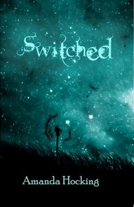
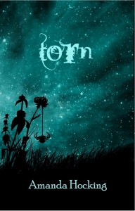
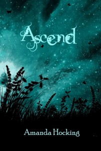
New Cover Art!
Leave a Reply
شركة تنظيف مجالس بالرياض
ترميم البيت
شركة شفط بيارات بالرياض
شركة تنظيف بيوت الشعر بالرياض
شركة تنظيف بالرياض
عزل الاسطح
شركة تنظيف بيارات بالرياض
شركة رش مبيدات بالرياض
شركة مكافحة حشرات بالرياض
شركة تنظيف مساجد بالرياض
شركة تنظيف قصور بالرياض
شركات صيانة خزانات المياه
شركة مكافحة الفئران بالرياض
شركة مكافحة النمل الابيض بالرياض
شركات مكافحة البق في الرياض
Really LOVE your series .. very impressed > < .. and i also love the fonts for this cover ! would you tell me the name of it or did you created it yourself ?
I prefer the covers with the girl on them, i like having a face to base the charcter on in my head, to bad Finn isnt on one…
I think they’re gorgeous!! I love the font and the color scheme is perfect!!
OK. This is the 3rd time trying to post this comment. Blogger keeps freaking out on me.
Thanks for having this contest!
I follow your blog with GFC. FB & Twitter.
My email addy: amydelrosso@gmail.com
http://twitter.com/ladyreaderstuff/status/29667079828
http://ladysbookstuff.blogspot.com/2010/11/my-blood-approves-trylle-trilogy.html
http://www.facebook.com/profile.php?id=1350491523
I did go ahead and make the font a brighter color to make it pop more, as per your suggestions. You guys were right. It did blend in a lot.
I make them using a combination of Photshop, Paint, Word, and Vector Art. There’s probably an easier way than I how I do it, but I’m learning as I go.
Love the font… I think each cover should be a different color, though, to differentiate them from each other.
Beautiful! You do such a good job, lady!
wow there amazing! how did you make them? by a computer software?
Love them! They are basically sex for my eyes. I can’t wait to have them in real life! Great job!
 Amanda Hocking

